Accessibility and Human Factors in Plotting#
Whenever you are generating plots to go into a paper or a presentation, there are a few things you can do to make sure that everyone can understand your plots:
Always make sure your text is large enough to read.#
In Matplotlib
plotcommands, Use thefontsizeparameter inxlabel,ylabel,title, andlegend, andtick_paramswithlabelsizeto increase the text size of the numbers on your axes.
Make graph elements easy to see#
Similarly, you should make the lines and symbols in your plots themselves big enough to see comfortably. In Matplotlib
plotcommands, you can usesto increase the size of your scatterplot markers andlinewidthto increase the sizes of your plot lines.
Seaborn contexts#
Seaborn provides a convenient way to scale both text and plot elements all at once, with the sns.set_context() function. “Contexts” are different contexts in which you might want to use a plot, such as in a paper versus a slide presentation or conference poster.
Here’s some code to plot some sine waves using Matplotlib
import seaborn as sns
import numpy as np
import matplotlib.pyplot as plt

# A simple function for plotting sine waves
def sinplot(flip=1):
    x = np.linspace(0, 14, 100)
    for i in range(1, 7):
        plt.plot(x, np.sin(x + i * .5) * (7 - i) * flip)
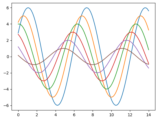
Plot with default styling; no seaborn context#
sinplot()
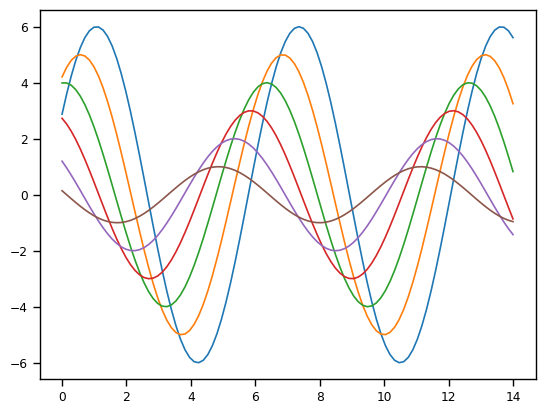
Plot with paper context#
sns.set_context("paper")
sinplot()
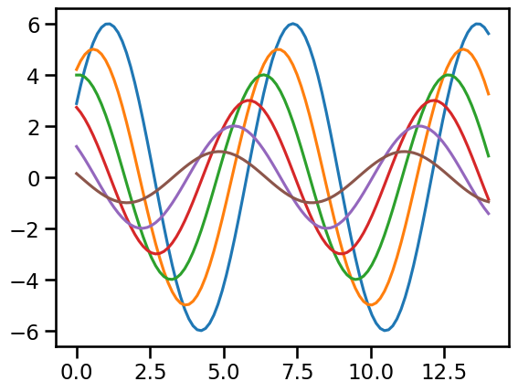
Plot with talk context#
sns.set_context("talk")
sinplot()
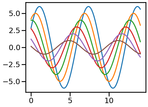
Plot with poster context#
sns.set_context("poster")
sinplot()
Consider colourblindness#
A non-negligible proportion of the population has some form of colourblindness. Human colour perception relies on our having three different types of cone cells in our retinas. It is estimated that 8% of males (1 in 12) have some form of colourblindness, typically a genetic absence of one of these cone types. Colourblindness is caused by a recessive gene on the X chromosome, so it is far less common for females to have it. So if you anticipate that, say, even 50 people view a graph you make, the odds are that 2 or more of them will have some form of colourblindness. Or put another way, if there are 20 people enrolled in this class, there is likely at least one colourblind student.
Colourblindness can range from mild forms (common) such as deuteranopia and protanopia (missing green or red cones, respectively; inability to distinguish red and green), and tritanopoa (missing blue cones) to complete achromatopsia (rare).
Using color (and nothing else) to distinguish between different plot elements (like lines representing different categories) may make your plots unreadable to anyone who is colorblind. For lines, the linestyle parameter lets you use different types of lines. For scatterplots, marker lets you change the shape of your points for different categories.
It’s worth trying out Coblis or Color Oracle to simulate what your plots (or any other image) would look like to those with colorblindness. This can be educational, and also a useful tool to check your plots. However, there are many colour palettes available in Matplotlib and Seaborn (including the defaults) that are designed to be distinguishable even by people with mild colourblindness. Install Color Oracle on your computer and view this page, and see what the Seaborn plots above look. like!
Matplotlib has an excellent page on choosing colormaps.
But as usual, Seaborn provides an even simpler option. It’s default colour palette is quite robust to different forms of colourblindness (i.e., most hues are distinguishable from each other), and it also offers a colorblind palette that is a slightly-adjusted version of the default that makes the hues even more distinguishable. Seaborn’s developer, Michael Waskom, also provides a page simulating what the Seaborn palettes look like with different forms of colourblindness.
sns.set_palette('colorblind')
sinplot()
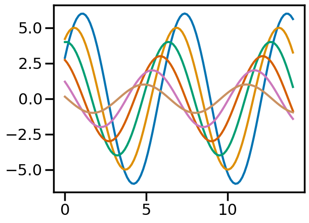
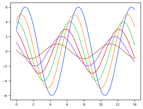
Note that once you’ve run sns.set_context() and/or sns.set_palette(), the setting applies to all further plots until you change the settings by running those commands again (or restarting the kernel)
sinplot()

sns.set_palette('bright')
sns.set_context('paper')
sinplot()
This section was adapted from Aaron J. Newman’s Data Science for Psychology and Neuroscience - in Python.